
Carlsberg case study.
Discover how the team at Arthaus worked with Carlsberg to redefine the identity of the Customer Development Training programme to be more diverse, inclusive and bring greater transparency.
Flexible and Adaptable
The identity needed to facilitate the growth of the programme...
Cohesion
The design needed to underpin and bring the programme together as a whole...
Instantly Recognisable
Instant recognition of where a module sits within the programme was key...
The Challenge.
To create an identity for the Customer Development Training Programme, bringing consistency and clear definition for each channel within the programme. The current football theme was on brand but not seen as inclusive. The theme was limited and did not facilitate the growth of the programme. The programmes success meant it is vital that the finished identity is flexible, accommodating additional channels as expansion continues.
Instant recognition of where each module fitted was key to facilitating a clear pathway. The programme needed to embody the Carlsberg brand, but still bring something new.

The Solution.
The Arthaus design process
We understand design and creating an identity that represents the brand and is easily identifiable. Using out proven design methods, we break down the process into three core stages, ensuring we ask the right questions of the client that allows us to deliver a solution that meets all their expectations.
Brand Positioning
The initial stage was to understand the programme and its function, and to look at other programmes within the business.
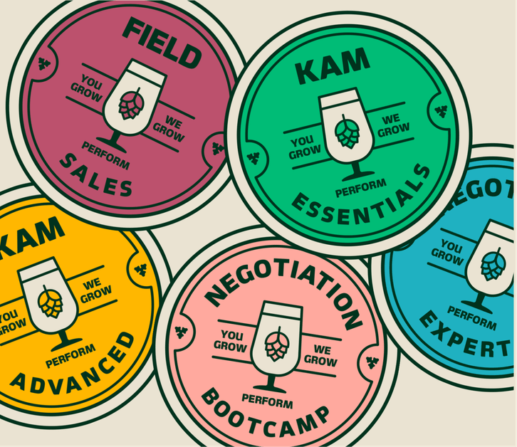
Beer pump badges were created for each channel, each with their own colour scheme creating individuality and recognition.
The ‘Big Idea’
We developed mood boards for 4 concepts, each very different, to discover where the final idea should sit.
Rigorous discussions and exploration of each concept eventually led to the ‘big idea’.
The Visual Identity
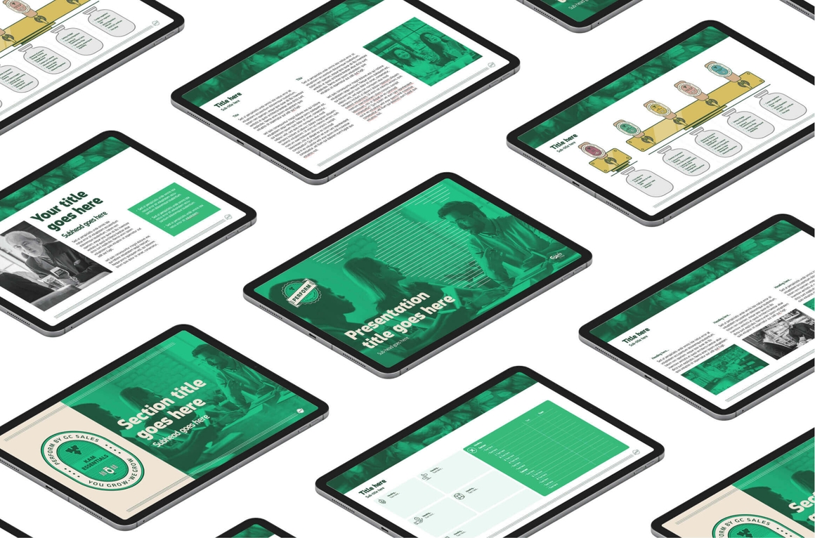
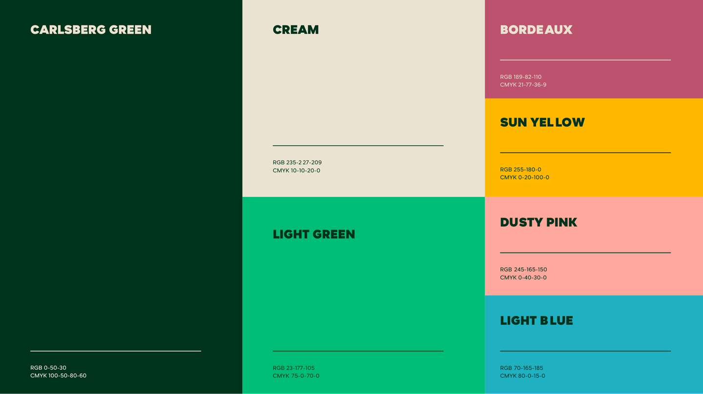
The final identity was carried through by creating brand guidelines and a set of master assets containing templates. Each channel was unique but still very obviously part of the programme.

The Outcome.
The key stakeholders welcomed the clear visual identity that embodies Carlsberg and represents the ethos of the brand. The framework has created cohesion and our teams have been inspired to deliver the content within the guidelines.

“It was only after you helped show us the possibilities, that we really communicated our goals, creating pressure on the deadline, but Arthaus really delivered when we needed it.”
Jimmi Thisted – Senior Global Manager, Customer Management


