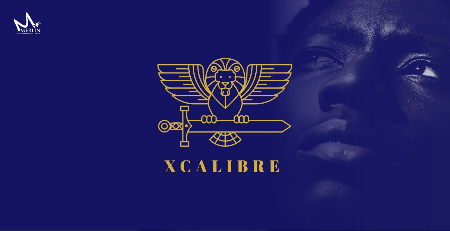
Merlin case study.
Discover how the Arthaus team worked with Merlin to develop a brand identity for their XCalibre Future Leader Development Programme
Look and Feel of Merlin
The logo needed to capture the look and feel of the Merlin brand...
Stand Alone
It also needed to be unique and be instantly recognisable...
Aspirational Qualities
The name XCalibre brings its own aspirational qualities...
The Challenge.
To design a logo for the XCalibre Future Leader Development Programme, a learning platform that has been in existence for nearly a decade but until now had not been branded.
With six Marketing Directors forming part of the latest cohort, the Leadership Development team were keen to create a new unique brand that encapsulated Merlin, but would also stand alone in the large collection of well established brands for each theme park and attraction in the Merlin group.
Furthermore, the brand needed to be able to connect to the attendees as well as underpinning the values and objectives of the course – quality, excellence, development and the need to be inclusive.
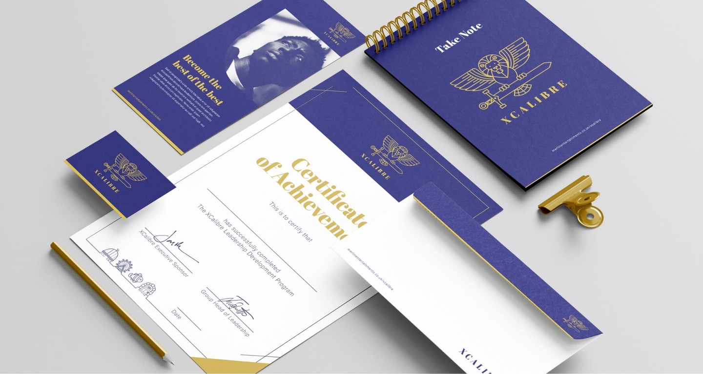
Attendees receive a certificate which included a set of new icons that represented the different attractions within the group.
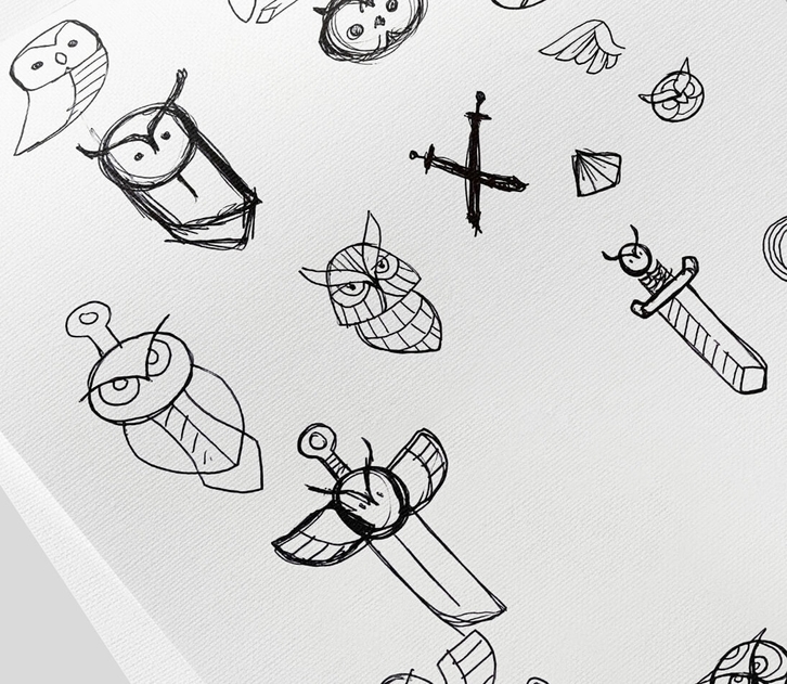
Alternative concepts:

The Solution.
The Arthaus design process
We understand design and creating an identity that represents the brand and is easily identifiable. Using out proven design methods, we break down the process into three core stages, ensuring we ask the right questions of the client that allows us to deliver a solution that meets all their expectations.
Brand Positioning
The initial stage was to understand more about the Leadership Programme and its function in the business.
Then to understand its place amongst the group’s strong and long standing brands for each part of the business.
The name XCalibre brings its own historical and aspirational qualities, which needed to be represented and identified.
The ‘Big Idea’
Whilst the background to the brand was multi- faceted, the brief was actually very open.
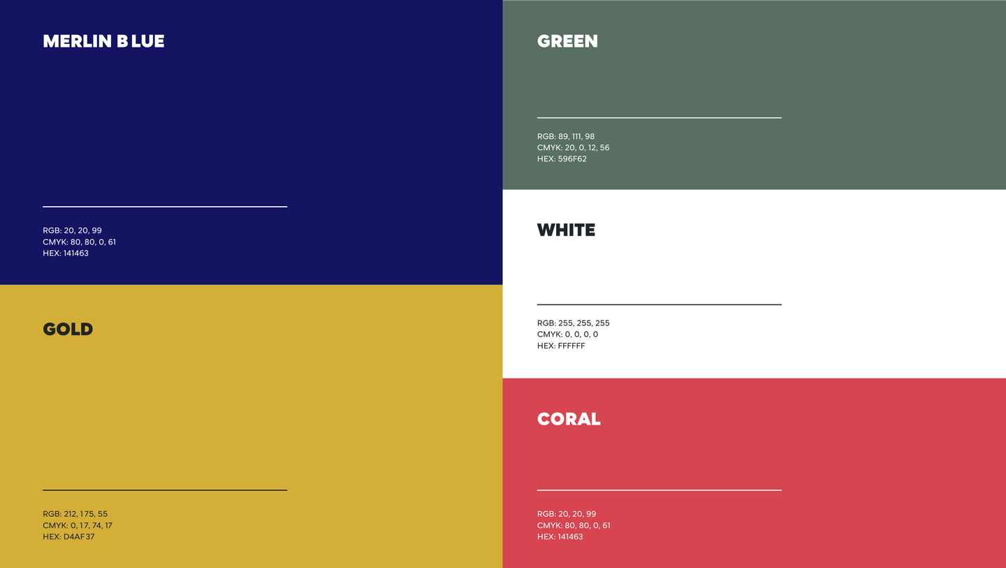
The colour palette would be strongly influenced by the Merlin Group brand guidelines, but the look and feel also needed to bring unique qualities.
The team looked at every brand in the group to understand them as a whole, using this as the foundation for the ‘big idea’.
The Visual Identity
Once the basis for the final idea was formulated it was quickly developed through to the final logo.
The time-scales were short so honest interactions were key to moving forward. Not holding any emotional attachment meant the workable ideas were quickly shortlisted and developed.
The Outcome.
The outcome was a unique logo that made an instant connection with the Senior Leader attendees. The new logo is used as a banner on all comms for the programme and on welcome packs, Presentations and certificates and will grow with the programme.
“The communication from the initial questions that went straight to the heart of what we wanted, and at each stage I was listened to and advised, it was very refreshing.”
Ioanna Papa, Group Head of Leadership Development


